Kyungdong is opening a new day as “The Global Leading Company in Energy
Resources Customers Trust” through passion and creative changes.
C.I
Design Concept
The existing symbol of Kyungdong Group expresses the image of the representative company leading the energy industry
with 火 (a Chinese character meaning fire) and K which is an initial of Kyungdong Group based on (人 : a Chinese character meaning
human) the philosophy of ‘Respect for Man’s Life and Dignity’.
The new symbol of Kyungdong Group is designed with a form in line with the global age which old tradition and spirit of Kyungdong Group
respecting human and making a contribution to development of humanity have been inherited while breaking from the form of 火 by reflecting the future vision
of Kyungdong Group that will not stay only at the energy industry but extend to more diverse and creative fields.

The spirit of Kyungdong Group that respects human and takes priority of happiness of humanity is represented
with h which means humanity, and it is expressed with K on the whole which symbolizes Kyungdong Group by adding a graphic element
symbolizing ‘Challenge and Innovation’ along with h.
Colors are comprised of blue symbolizing trust and orange meaning a spirit of challenge. This maintains the composition of color of the existing symbol,
and delivers ‘Being Kyungdong’ by retaining the company’s philosophy of Kyungdong.
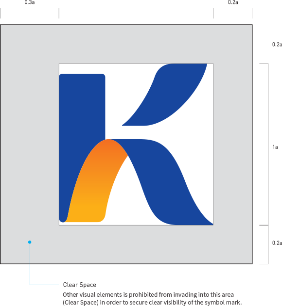
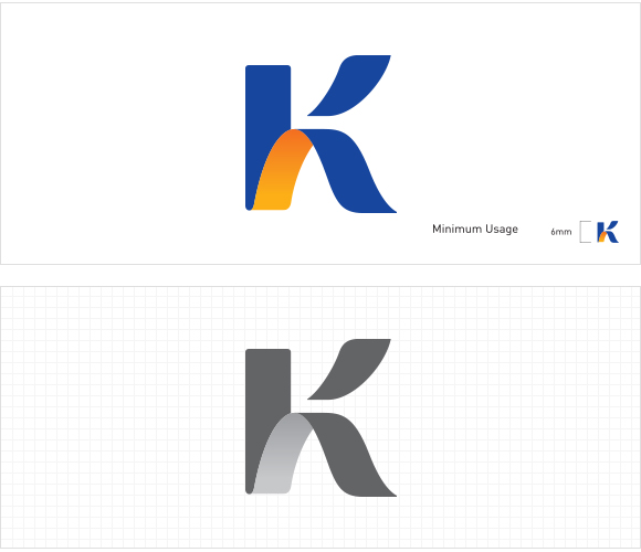
Symbol Mark
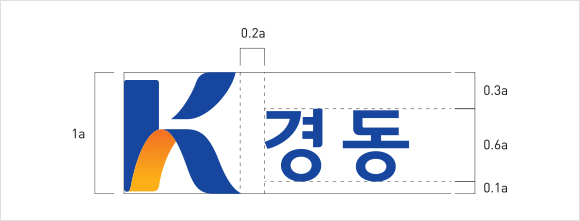
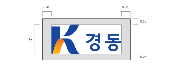
Type of Korean Logo
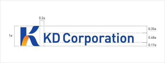
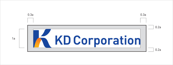
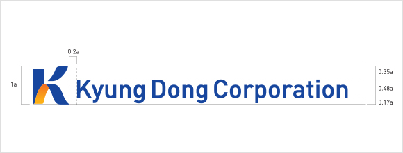
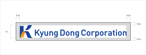
Type of English Logo
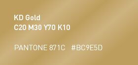
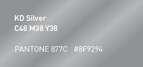
Exclusive Colors


